ARTICLE FROM ARS TECHNICA
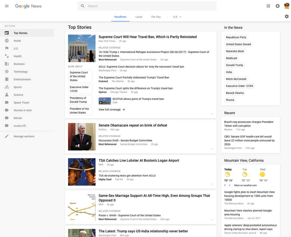
Google is launching a major redesign for Google News, bringing the site more in line with Google’s company-wide “Material Design” guidelines. A gray background and white cards around each story bring the site more in line with what Google has been doing on Android and makes it look a lot like Google Now. Everything is a lot more spaced out, so you’ll see less information on a single page. Google says the airier design is “designed for readability” and will make it easier to scan stories.
The site remains recognizable as Google News. There’s still a vertical column of sections on the left side, but now the list is customizable. There’s also still a right-side column that houses recent items, the weather, sports scores, and local news. Google is highlighting its “Fact Check” labeling program with a new block in the right column that will show “the top fact checked articles recently published.” One new navigation element is a top bar that lets you jump between top headlines, local news, and “For You”—a suggested content section.
Story cards will still expand to show different perspectives on a news story, with labels on some articles like “Opinion,” “Highly cited,” and “Fact Check.” At the bottom of a card is a new “Full Coverage” link, which will open up a new page full of stories about that topic. You can sort by date, top videos, or relevance.
The previous Google News design dated all the way back to 2011, when Google was using a “red and white” design theme that is still prominent on sites like Gmail and Google Calendar. For those keeping track at home, Gmail, Google Calendar, Google Translate, Google Groups, Hangouts, and Google Finance still lack Material Design themed desktop interfaces. They’ll all need to be updated eventually.
Listing image by Google / Ron Amadeo


